Help Library Design Cheatsheet
A list of the text styles and shortcodes that can be used when creating library articles.
For TextExpander users: I’ve also added all the shortcodes to the TextExpander shortcut
,hugo
Headers
Headers use a # before the heading text.
# → H1
H1
## → H2
H2
### → H3
H3
#### → H4
H4
Text Styles
*Italic Text* = Italic Text
**Bold Text** = Bold Text
~~Strikethrough Text~~ = Strikethrough Text
Block quote
text with > in front will create a block quote
> example blockquote
example blockquote
Unordered List
Use a * in front of an item creates a li
- Item 1
- Item 2
- Item 3
* Item 1
* Item 2
* Item 3
Ordered List
Using a number. 1. in front of an item for a ordered list
- Item 1
- Item 2
- Item 3
1. Item 1
2. Item 2
3. Item 3
Line
Three hyphens --- will produce a horizontal line
Code Block
Placing content between a set of three backticks ``` creates a code block:
This is inside a code block
Links
Inline link
For an inline link use the following format: [linked text](URL)
Example: Please see [Apple's documentation](https://support.apple.com/en-us/HT207582).
Result: Please see Apple’s documentation.
Reference link
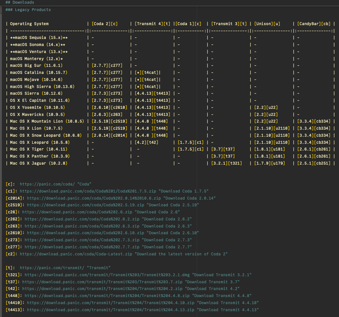
You can also reference a link and refer to a link at the end of a section. Helpful when there’s a lot of links, the OS Compatibility article is a good example of this:

Example:
This is an example [link][a]
To define the link: At the end of section or end of a page, we’ll call the identifier bracket with the link and alt text:
[a]: https://panic.com "Panic homepage"
This is an example link
This is an example [link][a]

[a]:  https://panic.com "Panic homepage"
Images
Shortcode to call a regular image: {{< img "image.png" "ALT-TEXT" >}}
Images are always centered.
Shortcode to call an inline image: {{< inline-img "image.png" "ALT-TEXT" >}}
inline images are inline or align an image left.
For an inline image, we can also add
"tinted"to the end of a shortcode to make the image match the text color. useful for monochrome icons.
{{< inline-img "image.png" "ALT-TEXT" "tinted" >}}Regular image:
Tinted:

|
Side by Side Image and TextWe can also add an image that’s side by side! |
Shortcode for side by side:
{{< side-by-side width="60%" url="image.png" alt="Alt Text" >}}
Content
{{< /side-by-side >}}
Side by Side Right Image and TextWe can also add an image to the right that’s side by side by adding |

|
Shortcode for side by side image to the right:
{{< side-by-side width="60%" url="image.png" alt="Alt Text" align="right">}}
Content
{{< /side-by-side >}}
Icons
Icons for the library currently use FontAwesome 4
Search for and find icons to use
For this example, let’s search for an use Truck as the example: https://fontawesome.com/v4/icon/truck
- The page will show an
<i>tag:<i class="fa fa-truck" aria-hidden="true"></i> - All we’re interested in is the
fa fa-truckin the class field, which is what we’ll always use for the shortcode
{{< fa fa-truck >}}
Which will get us, a Truck ! By default, calling an icon is also inline.
inline link with icon
I like differentiating links using the book icon, which we can add an icon shortcode inside an inline link bracket:
[{{< fa fa-book >}} Learn more about themes](/prompt/prompt-themes/)
Video
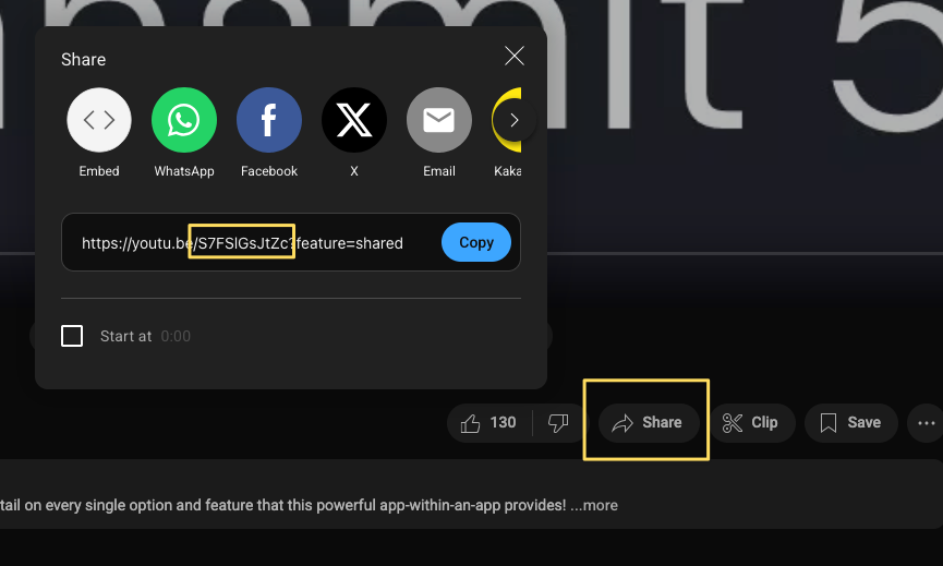
We can all a Youtube video by calling the shortcode share from the video: {{< youtube S7FSlGsJtZc >}}
From YouTube, we’ll want to copy just the number/letter string when we hit the Share button on the video:

And below is the video shortcode:
Centered Text
To center content, wrap content in the centered shortcode:
{{< centered >}}

{{< /centered >}}
Centered Content Example
Some Ipsum
Incididunt enim enim fugiat sint occaecat eiusmod magna sunt dolore deserunt exercitation duis aliquip. Pariatur ipsum est Lorem labore ad. Amet sunt excepteur anim anim ipsum quis sit ea duis velit dolor exercitation aute. Adipisicing esse aliquip sit quis ad cupidatat. Et quis culpa proident aliqua ullamco irure aute. Anim culpa ut commodo consectetur in cillum consectetur et tempor deserunt amet aute. Irure exercitation incididunt id adipisicing labore dolor pariatur eu deserunt qui eiusmod ullamco ipsum sunt.
Collapsible Sections
For a collapsible section, wrap the content in the collapsible shortcode:
{{< collapsible name="Collapsable" >}}
Content
{{< /collapsible >}}
Content